The were various versions made of the Daggerfall Logo. On this page I detail the creation of the logo, from the original sketches, through the initial design, and finally the completed logo. There was a mockup box created that was somewhat different from the final US release. I've also included that here as a comparison.
-
-
- Concept Sketches Some of the initial designs for the "D". The dragons forms the hilt of the dagger, and in turn the dagger formed the "D"
-
-
-
- Image copyright Bethesda Softworks
-
| Once the Dagger had been designed I came up with a few ideas for the text of the logo. Here a some early examples | |
| Various fonts were tried. Finally one was create from scratch in Alias. This sped any changes that were required as just a re-render was needed after each alteration. The hilt was created in Painter and pasted onto a "card" in Alias. I wanted the font to have a blade like look to it, which is why I have the edges beveled like a blade. |
The text below is the one I choose. Although it's not the final version. Once a mock up of the box was completed there were concerns from the marketing department theta it might not be readable. So it was altered. Even after this there were changes, when it was felt that the original Dragon design did not appear "D" like enough.
On the original box the spine was also to have featured the logo. This was later changed, but a spine logo was designed and used for a while on the pre-production boxes. The European release used this logo I believe, as did the game CD.
Here's the first attempt at the font (above). This was felt to be too unreadable. To the marketing minds it didn't shout out across a crowded store. The "A" was especially problematic in this respect.
| Below the original with wing vanes
|
The final version, sans veins, and more "D" like.
|
In the midst of all this Bethesda's publisher in Europe, Virgin, needed artwork for their ad campaign. The original design was at that time the one Bethesda was going to use and this was the one Virgin received. As part of their campaign they had a paper knife designed in the same of the logo. After a quick call to Virgin a package arrived a few days later in the mail with my knife. Here's a couple of views.
The Daggerfall Knife
 |
Here's a closeup of the knife's hilt
 |
-
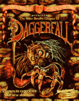
The US Cover:
-
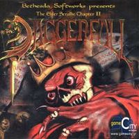
The European cover
-
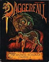
The original box
-
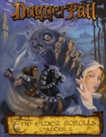
Early design concept for Daggerfall box.
.gif)
_02.jpg)

